Alyssa Forman | Internship | 2026
Climate Books for Classrooms
Time Frame
6 months
Role
UX/UI
Research
User Testing

OVERVIEW
What started as an in-class internship grew into paid freelance work. The project set out to bridge the gap between educators and climate education. Partnering with a Boston College professor and her students, we designed a platform showcasing a curated, ever-growing collection of climate education books paired with instructional guidance to help teachers integrate them seamlessly into their lesson plans.

Our design and research work contributed to Climate Books for Classrooms being named a 2026 Carnegie-Whitney Grant recipient.
PROBLEM
Teachers don't feel supported enough to teach about climate eduction.
U.S. educators report feeling less supported when compared to other educators in other countries.
RESEARCH
Research revealed a striking gap: education has the potential to reduce carbon emissions by up to 85 gigatons by 2050, yet only 17% of U.S. educators feel adequately supported to teach sustainability. This tension became the foundation of our research, understanding not just what teachers need, but why current tools were falling short.
Three Key Insights emerged that directly shaped our design:
These findings drove the core features of our design. Separately, user testing and ideation surfaced modal filtering as the most effective solution to one of the experience's biggest friction points.
1.
Teachers plan lessons around holidays and seasons, making contextual organization essential
2.
Teachers hesitate to purchase books they can't preview, creating a barrier to discovery
3.
Grade-level filtering is a top priority when browsing educational content
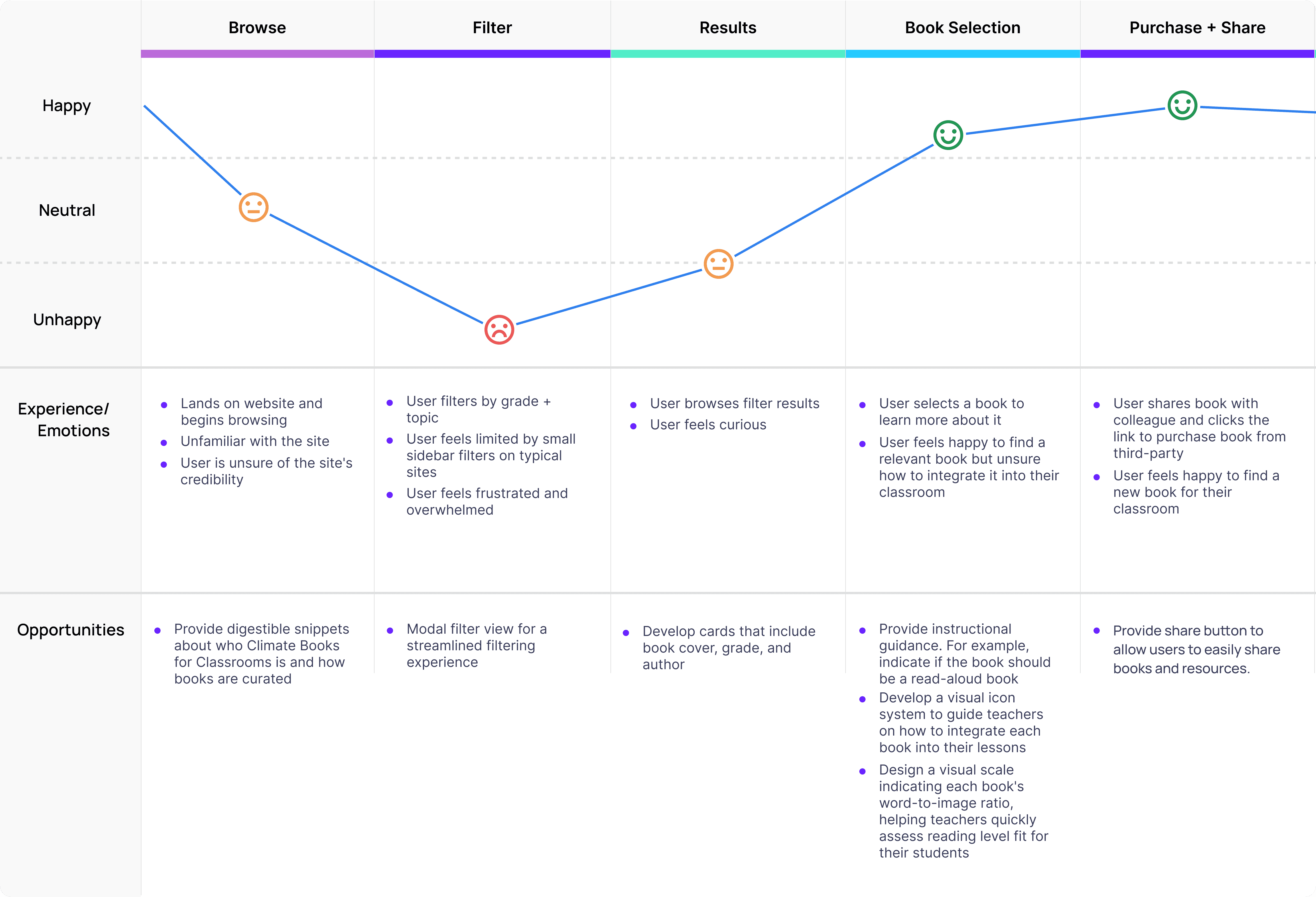
JOURNEY MAP
Understanding users current struggles finding books for their classroom

DESIGN PROCESS
This project required designing a single product that served two very different users — a content editor continuously updating the database, and teachers searching for the right classroom book.
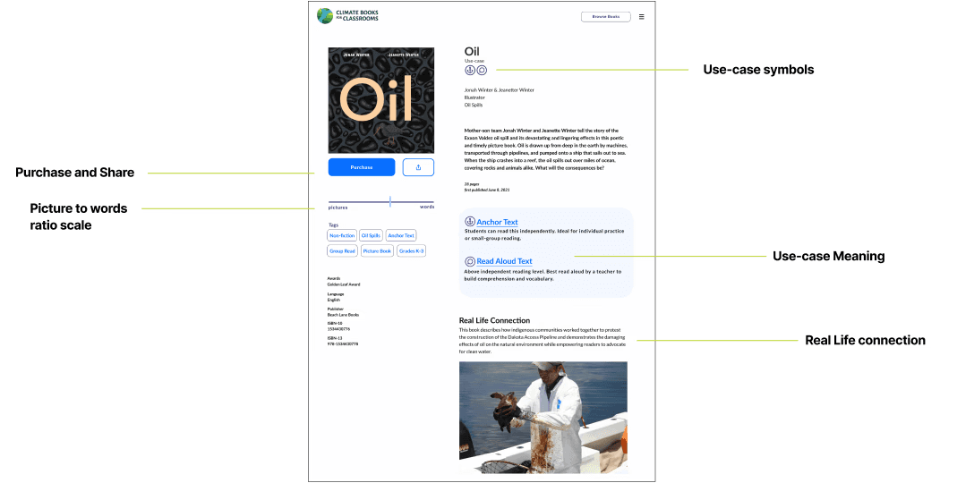
Key Feature | Book Page
There are a few key features of the book page that we needed to solve for our users' problems.
One pain point that surfaced repeatedly in interviews with the client and educators was uncertainty around how to use a book once they'd found it. When lesson planning, teachers struggled to tell at a glance whether a book was a good fit for independent reading, or whether its vocabulary and complexity made it better suited for a read-aloud.
Another issue that came up during our interviews was the struggle people face when buying books online — especially children's books, where the ratio of pictures to words matters far more than we'd initially considered. While a full page preview was out of scope for this project, it pushed me to think about other ways to solve the same problem. I landed on a words-to-pictures scale that content editors could set for each book upon upload, giving teachers a quick way to gauge whether a book's format matched what they were looking for.
Our client also wanted a way to connect books to real-world events. Through the content editing tool, the client can upload and attach relevant real-life connections to each book, giving educators added context to share with students.

Key Feature | Modal Filtering
Journey mapping revealed filtering as the biggest pain point. Sidebar filters felt limiting and overwhelming when navigating many options, so a modal system was chosen to create a focused, uncluttered filtering experience that could scale as the client added more categories over time. As a team we had a hard time deciding on the best way to filter and search however it was very important for us to realize that this website served more as an explorative tool meaning that filtering would be use much more frequently than searching.

