Alyssa Forman | Branding | 2025
Strum Junkie
Time Frame
3 months
Role
Freelance


OVERVIEW
Freelance project developing the complete brand identity and packaging design for Strum Junkie, a pick guard company for guitarists. Responsible for story telling and creating the visual identity from the ground up, including logo design, typography, color palette, and brand guidelines, as well as packaging design that reflects the brand's personality.
OVERVIEW
Freelance project developing the complete brand identity and packaging design for Strum Junkie, a pick guard company for guitarists. Responsible for story telling and creating the visual identity from the ground up, including logo design, typography, color palette, and brand guidelines, as well as packaging design that reflects the brand's personality.
PROBLEM
Make a brand that empowers female guitarists.
PROBLEM
Make a brand that empowers female guitarists.
RESEARCH
While women now make up nearly 50% of new guitar players, they remain heavily underrepresented throughout the guitar industry and commerce space. A study conducted by Fender found that women account for half of all beginner and aspiring guitarists in the U.S. and U.K.
Despite this growth, representation within guitar culture still skews heavily male. Women remain underrepresented in artist endorsements, signature guitar lines, music production, and gear marketing. Studies on the music industry continue to show significant gender disparities, with women making up only a small percentage of producers and technical roles. When designing for Strum Junkie, it was important to align the branding to speak to an underrepresented audience.
RESEARCH
While women now make up nearly 50% of new guitar players, they remain heavily underrepresented throughout the guitar industry and commerce space. A study conducted by Fender found that women account for half of all beginner and aspiring guitarists in the U.S. and U.K.
Despite this growth, representation within guitar culture still skews heavily male. Women remain underrepresented in artist endorsements, signature guitar lines, music production, and gear marketing. Studies on the music industry continue to show significant gender disparities, with women making up only a small percentage of producers and technical roles. When designing for Strum Junkie, it was important to align the branding to speak to an underrepresented audience.
SOLUTION
In early on meetings with the client, we decided the brand identity should feel empowering, gritty, feminine, and unapologetically non-conformist reflecting the bold personality of the musicians who use it.
SOLUTION
In early on meetings with the client, we decided the brand identity should feel empowering, gritty, feminine, and unapologetically non-conformist reflecting the bold personality of the musicians who use it.
Logo Exploration
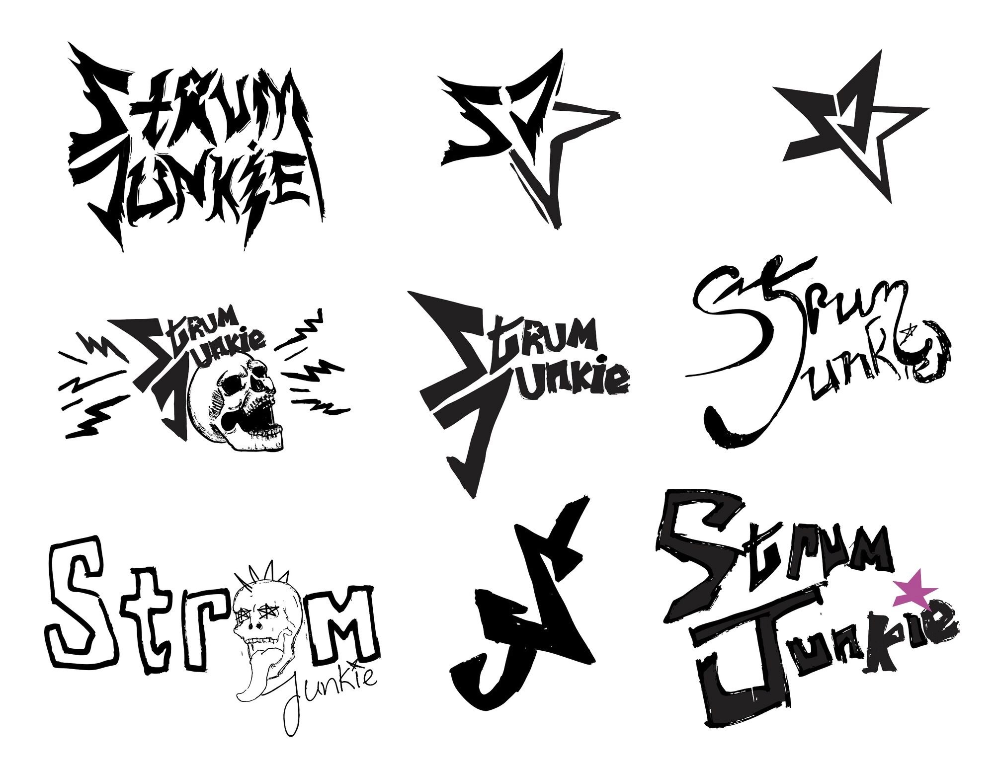
After deciding with the client on Strum Junkie's tone, I began sketching and iterating on ideas. The client really wanted a star incorporated, which can be an overdone symbol, so I experimented with different ways to include one. I used paint markers to hand-draw different logo ideas to communicate authenticity and grit.
Logo Exploration
After deciding with the client on Strum Junkie's tone, I began sketching and iterating on ideas. The client really wanted a star incorporated, which can be an overdone symbol, so I experimented with different ways to include one. I used paint markers to hand-draw different logo ideas to communicate authenticity and grit.
Final Logo


Color Palette
Pink can be a cliche way to represent women however Strum Junkie reclaims it for empowerment. Pink is often dismissed as overly “girly,” immature and weak and because of that, many women are subtly taught to feel embarrassed of the color.
Color Palette
Pink can be a cliche way to represent women however Strum Junkie reclaims it for empowerment. Pink is often dismissed as overly “girly,” immature and weak and because of that, many women are subtly taught to feel embarrassed of the color.

Packaging
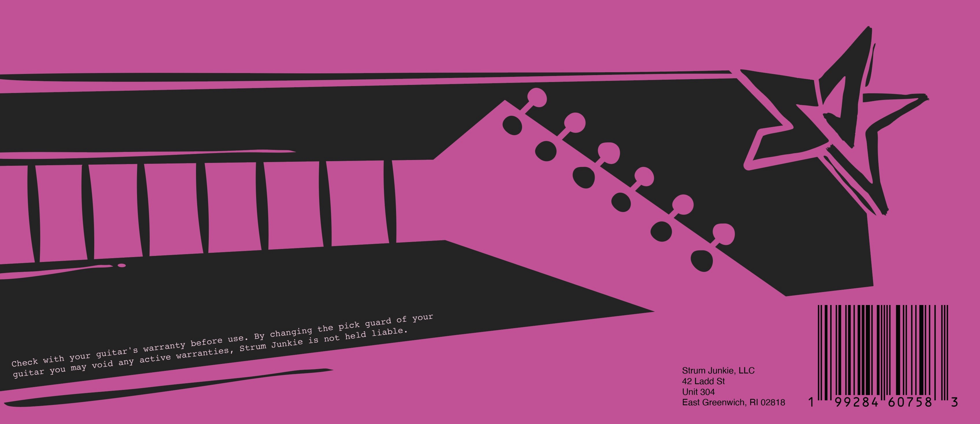
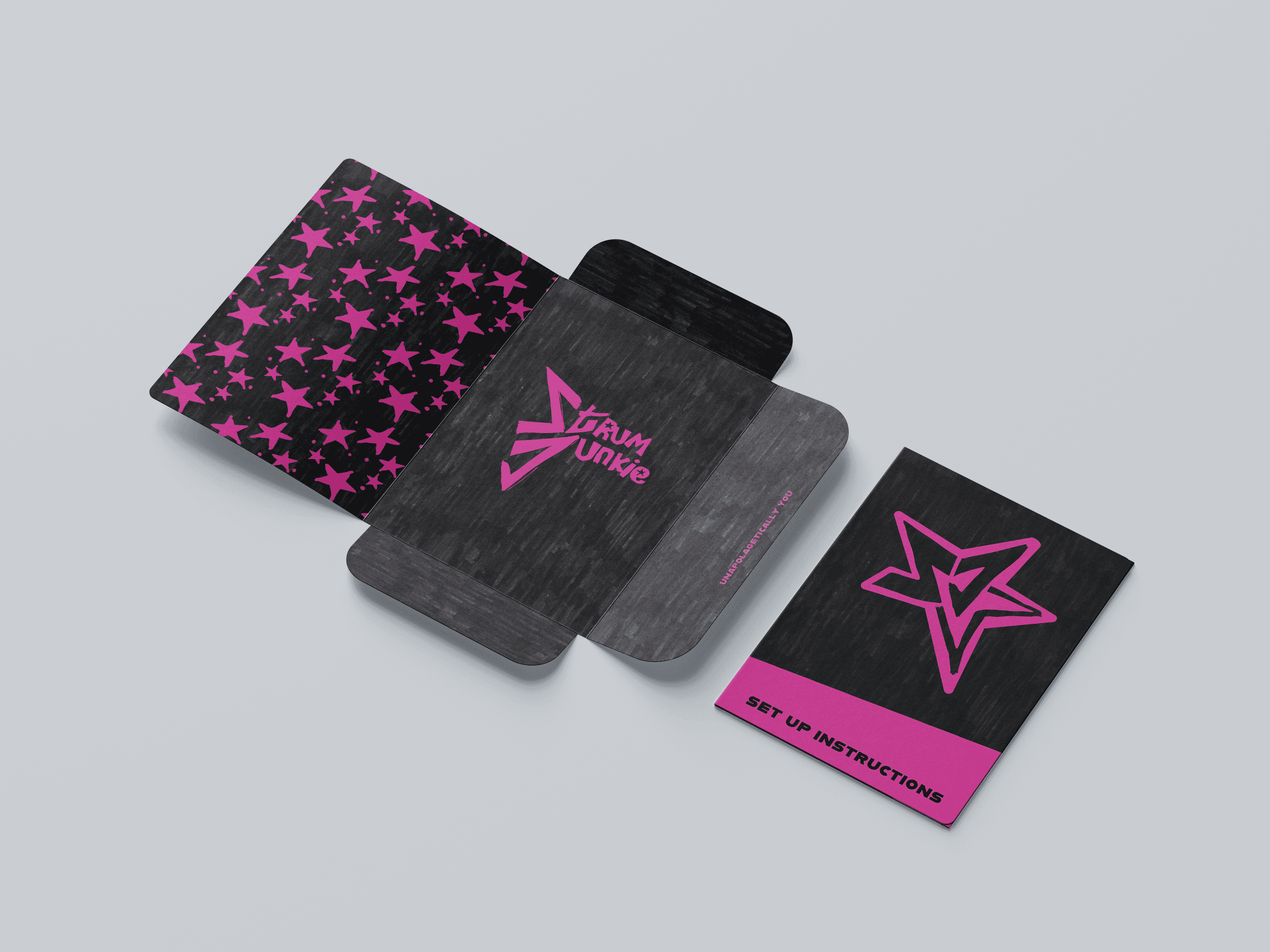
Continuing with a scrappy, hand-drawn aesthetic, the final packaging design was created. Staying true to the hand-drawn look, I was also inspired by the paneling used in comic strips, and decided to use imperfect, angled boxes to create movement.
Packaging
Continuing with a scrappy, hand-drawn aesthetic, the final packaging design was created. Staying true to the hand-drawn look, I was also inspired by the paneling used in comic strips, and decided to use imperfect, angled boxes to create movement.